
 EN
EN


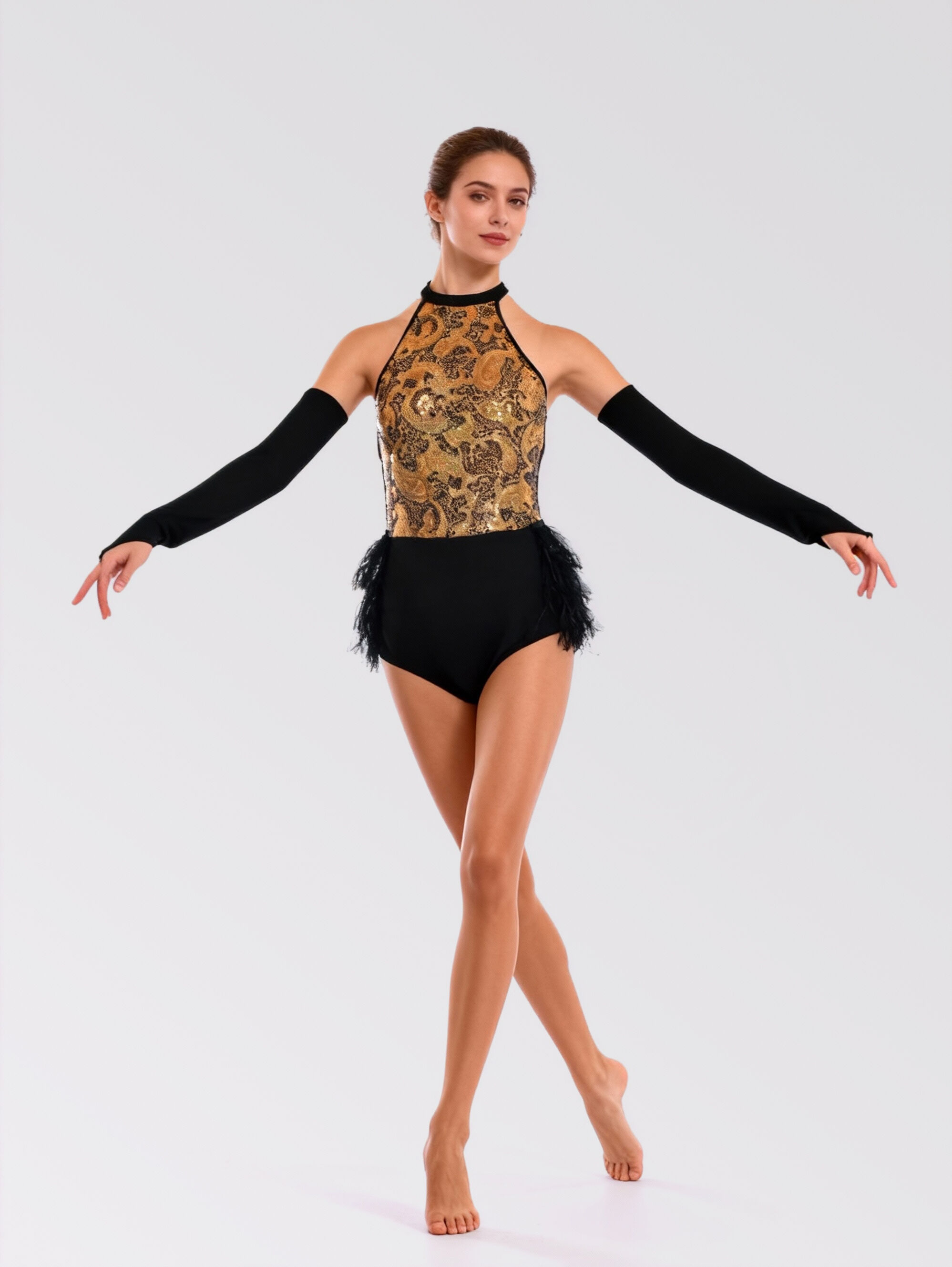
Exploring the Psychological and Visual Impact of Stage Hues
Visual Dynamics and Dynamic Movement on Modern Stages
Choosing the right palette for a live performance involves much more than simply tracking down seasonal fashion trends. On a brightly illuminated platform, colors undergo massive transformations under moving spotlights and colored gels, directly altering how an audience perceives choreography. For a high-energy jazz showcase, the choice of apparel hue dictates the initial emotional connection before a dancer even executes the first movement. High-contrast shades possess a distinct ability to amplify body lines and accentuate synchronized rhythmic isolations. Lighting designers often point out that certain undertones absorb ambient radiance while others refract it dynamically across the auditorium. Incorporating striking visual components into performance apparel guarantees that the choreographic patterns look sharp, unified, and perfectly synchronized with the musical landscape.
Triggering Audience Engagement Through Selective Color Palettes
Understanding the psychological associations of different color spectrums is vital for dance directors looking to leave a lasting impression on theatrical judges and casual spectators alike. Intense crimson, electric violet, and deep fuchsia work exceptionally well for jazz routines because these saturated pigments communicate power, confidence, and uninhibited passion. Conversely, incorporating metallic finishes like liquid gold or polished chrome adds a layer of sleek, contemporary sophistication to the performance. These reflective materials capture multi-angled stage beams, transforming standard choreography into a mesmerizing spectacle of light and shadow. Selecting the ideal color profile ensures the choreography feels authentic and memorable, creating an unforgettable atmosphere for global viewers and theatrical enthusiasts.
Balancing Material Innovation with Illumination Resilience
Fabric Reflectivity and Structural Integrity Under Intense Spotlights
An incredible design entirely loses its theatrical impact if the fabric washes out, appears dull, or loses its luster under heavy halogen or LED stage lighting arrays. Striking a balance between visual brilliance and textile resilience requires an advanced understanding of fabric compositions. High-caliber performance apparel typically relies on multi-dimensional spandex blends, premium sequins, or specialized foil prints that secure color depth at a structural level. These high-grade textiles ensure that deep neon tones or rich dark velvets maintain intense color saturation without looking washed out under thousands of watts of illumination. Investing in premium textiles prevents a faded appearance, preserving a pristine appearance from the opening counts to the final pose.
Operational Practicality and Color Longevity Across Competitive Seasons
The everyday realities of touring schedules and competitive dance seasons must guide apparel decisions for dance schools and professional companies. Wardrobe managers frequently select intermediate jewel tones like royal blue, rich emerald, or vibrant turquoise for a versatile jazz wardrobe. These specific color profiles offer an ideal compromise, providing a bold visual footprint while easily hiding minor scuffs or sweat markings during intense back to back regional showcases. This practical design approach ensures that performers maintain an impeccably polished image during every single routine, upholding the aesthetic excellence of the academy without accumulating excessive maintenance overhead.
Synchronizing Global Production Excellence with Group Identity
Delivering Uniform Consistency and Technical Innovation to the Stage
Presenting a flawless group routine across international venues demands a manufacturing collaborator capable of executing precise dye matching and uniform structural stability across dozens of garments. For dance organizations aiming to scale their performance identity seamlessly without worrying about color variations between production runs, aligning with an expert producer like ASC offers a major strategic advantage. Leveraging specialized garment manufacturing processes and a highly robust global material supply chain, ASC ensures that every single piece of performance apparel aligns with demanding international aesthetics and precise color parameters. This large scale fabrication capability allows growing performance brands to maintain complete uniform consistency, ensuring that the visual concept remains powerful, clean, and beautifully executed across any performance venue.
Frequently Asked Questions on Performance Wardrobe Selection
What types of colors perform best under rapidly changing multicolored LED stage lights? Saturated primary shades and high-grade metallic tones perform exceptionally well because they retain their core visual identity without shifting into muddy, unappealing tones when exposed to shifting green, blue, or yellow lighting filters.
How does a wardrobe manager ensure that neon jazz apparel does not look cheap or washed out on a large stage? Incorporating textured elements like matte mesh overlays, dense sequin embroidery, or deep contrasting trim helps break up monochromatic neon fields, adding sophisticated depth and dimension that registers beautifully from the back row.
Why are deep jewel tones recommended for contemporary jazz routines over pastel color palettes? Deep jewel tones provide strong contrast against standard theater backdrops and dark scenery, emphasizing intricate lines and quick physical transitions far more effectively than soft pastels, which tend to blend into the stage floor.